

.png)
Migrally
.png)
Migrally main challenges
One of the biggest challenges in this project was turning complex migration information into something clear, friendly, and human while keeping it accurate and trustworthy. Migrally also needed to balance personalization and responsibility — adapting to each user’s country and goal without replacing official sources. Designing a calm, inclusive experience, structuring vast information into a simple flow, and keeping content up to date across regions all required careful thought, shaping Migrally into a platform that will keep evolving over time.
What Migrally taugth me
What I learned the most from this project was how to transform heavy, technical information into something human and easy to follow — without losing accuracy. I also realized how much visual clarity matters when dealing with complex topics; every color, word, and layout choice can change how users feel while navigating them. More than anything, I learned that good design isn’t only about function — it’s about creating calm and trust in moments when people need guidance the most.
Future of Migrally
The next steps for Migrally focus on continuing user research and iterating based on real feedback to refine both the experience and how information is presented. There’s still a lot to explore as the platform expands to cover more regions and migration paths. Over time, Migrally will continue growing as an NGO project with the same purpose it started with — bringing clarity and emotional support to the migration process. In the future, it may integrate AI systems connected to official sites in real time, ensuring accuracy, trust, and personalization at every step.

Reasons for Migrating
How might we personalise migration information so it adapts to different motivations (career, family, education, safety)?
Sources of Information
How might we make official migration information as accessible and relatable as advice from a trusted friend?
Trust & Reliability
How might we combine verified official information with peer-shared experiences in a trustworthy format?
Challenges
How might we help users plan around process timelines and requirements to reduce delays?
How might we translate legal and procedural language into clear, user-friendly terms in multiple languages?
Emotional experience
How might we design Migrally to reduce anxiety, build confidence, and celebrate milestones during the migration journey?
Extras
How might we deliver migration information through interactive formats that users can explore at their own pace?
Project Overview
My Role
UX /UI designer
Project duration
1 month
Tool Kit
Figma, Miro, Stitch, Unicorn Studio, UIwiki
Purpose
Migrally was designed to simplify the migration journey, helping users understand what’s needed and where to begin
What is the problem?
Migration is never just about documents — it’s about people, emotions, and the uncertainty of starting over somewhere new. Yet for many, it becomes a maze of confusing terms, endless websites, and information that’s hard to trust. What should be a hopeful beginning often turns into a process filled with stress and frustration.
What is Migrally goal ?
Migrally was created as a non-profit digital initiative to bring calm, clarity, and empathy to that experience. Its goal is to make migration guidance simple, human, and accessible — turning complexity into understanding and helping people begin their journey with dignity and confidence.
My designing journey
Empathise
Define
Ideate
Prototype
Test
Emphatise
Research insights
What the users say
“I spent hours on government pages and still didn’t know what to do next.”
“If someone could just explain it clearly, I’d feel so much calmer.”
“I don’t trust forums, but at least people there explain things like humans.”
Competitive Audit
Competitor
VisaGuide
Schengen Visa
Experts for Expats
Features
Free tool offering general visa and permit information.
Provides reliable visa information for the Schengen region.
Paid consultancy offering legal, tax, and relocation services for expats.
Strengths
• Clear and simple layout.
• Straightforward tone that makes content easy to follow.
• Fully responsive on mobile.
• Easy to navigate and visually consistent.
• Reliable, direct tone.
• Organized, structured information.
• Strong, professional brand identity.
• Clear, trustworthy tone.
• Excellent accessibility on all devices.
Weaknesses
• Limited personalization or filters.
• Some confusing navigation paths.
• Available only in English.
• Only covers the Schengen area.
• Less interactive experience.
• Mobile version less intuitive.
• Services are paid and not inclusive.
• Limited to specific topics (not full migration help).
• Feels formal
Research
Qualitative, human-centered interviews to understand people’s real experiences with migration.
Target Participant
-
Ages 20–40, planning to migrate for study, work, or family.
-
Digitally savvy but confused by complex visa systems.
-
Seeks clear, visual, and trustworthy guidance to navigate the process.
Interview Goals
To explore how people experience the migration process — understanding where they look for information, what confuses or worries them, and what kind of guidance would make them feel supported, informed, and confident in taking their next step abroad.
How might we
The voices from the interviews revealed more than frustrations — they showed real emotions, fears, and hopes behind every migration story. These insights became the foundation for the How Might We questions, helping transform what users felt lost about into opportunities to create clarity, confidence, and support along their journey.
Define
Affinity Map


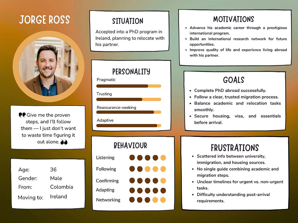
User Persona
Migrally’s users are people preparing to start a new chapter abroad — students, professionals, and families looking for clarity and support in a confusing process. Each persona reflects real emotions, needs, and motivations behind the decision to migrate.

.jpg)
User Journey Map
.jpg)
.jpg)
.jpg)
.jpg)
Ideate
User Flow Version 1
User Flow Version 2

First ideas
Crazy 8
With limited time, the first ideas took shape on paper — quick sketches that helped visualize how guidance could flow naturally for users. Instead of spending too long refining wireframes.


To speed up the UX process within a tight schedule, I explored AI tools to generate early mockups that inspired the high-fidelity prototypes and helped shape the visual direction while staying true to the original paper ideas.


Migrally’s branding balances warmth and clarity — orange represents optimism and new beginnings, while blue reflects trust and calm. Together with white space, they create a visual language that feels human, open, and reassuring.


.png)
.png)
Prototype
Once the main structure was defined, the focus shifted to bringing Migrally to life through a high-fidelity prototype. The goal was to transform clarity and guidance into a real, interactive experience. Paper sketches evolved into digital screens, and AI tools were explored to speed up design decisions, generate visuals, and refine ideas — allowing the concept to grow faster while staying true to Migrally’s human-centered vision.


The high-fidelity prototypes were designed to bring clarity and flow to the user experience. The goal was to keep the journey simple yet informative — offering a clear visual guide that helps users understand each step of their migration process with confidence and calm.
.png)
.png)
.png)
.png)
.png)
.png)
.png)
.png)


.png)
Testing
Research background
After creating Migrally’s high-fidelity prototype, usability testing was conducted to see how easily users could navigate and connect with the platform. The focus was on keeping the experience clear, structured, and emotionally supportive.
Research goal
This phase focused on understanding if users could naturally follow the process — especially when looking for visa information or planning their arrival. It also aimed to see if Migrally felt intuitive, trustworthy, and genuinely helpful rather than confusing or overwhelming.
Before
After
.png)
The goal was to make the experience feel personal and supportive. That’s why I added three simple filters — where you’re from, where you’re going, and why — to guide each user through their own journey.
However, after testing, users suggested that to make it feel more like a real journey, the filters could be presented as a single continuous path — similar to how you search for a flight online — instead of three separate steps.
Before
After
.png)
Users also responded positively to the idea of a vertical timeline that guides them through each stage of the process, helping them visualize their progress and feel supported along the way.
In the first test, some users missed the Learn more link due to its color, so it was replaced with a clearer button. The straight timeline was also reshaped into a curved path to better reflect the feeling of a journey.
Before
After
.png)
.png)
At first, each stage of the journey included a footer placed before and after the section, guiding users with Previous step and Next step options to move through the process.
Nevertheless, users often felt confused and lost track of where they were in the process. To solve this, each button was updated to include the name of the previous and next page, making navigation clearer and more intuitive.