


CASA MAYA
%201.png)
Project Overview
My Role
I redesigned an existing e-commerce site for Mexican products in South Africa. Since I wasn’t authorized by the original brand, I renamed it Casa Maya for independent presentation.
Tools
Figma, Canvas, AI to generate images, Miro
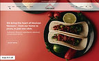
Purpose
This is the space to introduce the Product section and showcase the types of products available.
Project duration
The project took 2 months
The problem: From Personal Need to Design Opportunity
As a Mexican living in South Africa, I often searched for authentic ingredients to recreate the flavors of home — that’s how I found Azteca, an online store for Mexican products. My first visit was on mobile, and it took me a while before I felt ready to place my first order. That hesitation made me wonder: why did it take time for me to trust them? And if I felt that way, were other expats or local users experiencing the same? That question marked the start of this redesign project.
The goal: Redesigning Trust and Connection
My goal was to understand what stops users from feeling confident when buying Mexican products online and to redesign the experience to feel more transparent, intuitive, and culturally connected. By transforming Azteca into Casa Maya, I wanted to create a space where both expats and local food lovers can trust what they buy and feel inspired by the culture behind every product.
My designing journey
Empathise
Define
Ideate
Prototype
-
Type: Qualitative research
-
Method: Unmoderated user interviews
-
Participants: 8 users based in South Africa
-
Goal: Understand shopping behaviors, challenges, and trust factors when buying Mexican food products online
Research
Emphatise
Target Participants
Adults aged 25–40 living in South Africa who shop online often, cook at home, and enjoy exploring new cuisines. They value authentic ingredients, convenience, and reliable delivery, and are interested in buying Mexican products to connect with culture and self-expression.
-
Understand what makes it hard for users to find and choose Mexican products online.
-
Identify pain points in browsing, product details, and checkout.
Interview Goal
Interview insights
The interviews confirmed that a redesign was needed and revealed where users struggled the most. Many mentioned confusion, missing information, and low trust during their shopping experience.
Competitive audit
Competitor
Mercado
Santa Annas
Mexican Imports
The Deli
Features
Basic e-commerce layout with shipping calculator
Engaging shopping experience with nutritional info and store locator
Simple, static shopping platform with contact-based purchases
Modern layout with reviews, loyalty program, and clear shipping info
Strengths
+ Welcoming interface
+ Fully responsive on mobile
+ Straightforward product access
+ Fun, interactive design
+ Strong visual identity and consistency
+ Responsive across devices
+ Easy to find product information
+ Consistent color palette
+ Clean, intuitive navigation
+ Responsive and easy to browse
+ Transparent delivery and review system
Weaknesses
– Minimal brand identity
– Limited product details and usage info
– Only available in English
– Confusing checkout flow
– Online purchasing not always functional
– English-only accessibility
– Not fully responsive
– No functional cart or checkout
– Inconsistent typography and imagery
– No filters or sorting options
– Some product details hard to locate
– Limited cultural storytelling
Define

User personas
After understanding where users struggled, I started to see two clear stories emerge — one from people missing the taste of home, and another from those curious to explore it. These became the foundations for my two main personas: Claudia, the Mexican expat, and Sipho, the South African home cook.


Value preposition
From their stories, it became clear that the redesign needed to do more than just look better — it had to build trust, offer guidance, and make every step feel simple and authentic for both Claudia and Sipho.
1
Checkout screen

Build trust with clear shipping and more payment options.
2
Product page

Improve visuals, details, and ingredient guidance.
3
Home page

Build trust with clear shipping and more payment options.
From Needs to Redesign Priorities
After understanding users’ journeys, it became clear which parts of the site created the most friction. I focused on the screens that had the biggest impact on trust, clarity, and the overall shopping experience. My focus was in the following:
.png)
User Flow
Ideate
Information Architecture
To make the experience clearer and easier to navigate, I reorganized the site structure so users could find what they need faster — without getting lost along the way.

Low fidelity
.png)


First sketches


The original site didn’t guide users on where to start, and for some, it felt outdated and lacked trustworthiness.
Before
After
.png)
Prototype
.png)
The new homepage tells a story, highlights the brand, and features a clear call to action.

At first, overlapping categories and a cluttered layout made it hard to find products or browse by dish.

In the redesign, users can easily view categories in the nav bar and explore without confusion.

Originally, users had trouble telling products apart and understanding how to use them.

In the redesign, users can see products more easily thanks to a clearer layout.

Product descriptions and images weren’t consistent, making it unclear what to expect or how to use certain items.

Now, product descriptions and images are consistent, making it easy for users to understand each item and how to use it.
.png)


.png)

The challenges
The biggest challenge was redesigning a third-party site without losing its essence. Since I couldn’t use Azteca’s brand, I created Casa Maya to capture its spirit while aligning it with real user needs—balancing respect for the original identity with a clearer, more human experience.
What I learned
I learned that a redesign is less about changing visuals and more about translating a brand’s story into something people can feel and trust. Early research helped me see how cultural identity and usability can work together when every design decision starts from empathy.
What is next
The next step is testing the new experience with users to see how it performs in real contexts—measuring trust, ease of navigation, and overall satisfaction—to keep evolving Casa Maya into a space that truly connects people with Mexican culture.