
Challenges
The biggest challenge was learning how to condense and simplify something as complex as a medical record system. Finding balance between doctors’ needs and usability wasn’t always easy — some requests would have created new usability issues. Keeping the design functional but still intuitive required constant adjustment and testing.
What I learned
I learned that we often make assumptions based on previous research, but usability testing is what truly reveals users’ real needs. Listening, observing, and testing again made me realize how vital it is to challenge our own assumptions and design from evidence, not expectation.
What is next
Moving forward, I’d like to keep refining VitalCare by testing new features with more medical professionals and exploring ways to make complex data even easier to manage. Future iterations will focus on improving accessibility, personalization, and seamless integration with other tools doctors already use.
Overview
My Role
UX/UI designer
Project duration
5 months
Tools
Figma- Miro- Canvas
Purpose
Designed as an independent case study exploring solutions in healthcare.

.png)
.png)
.png)
VitalCare
The problem: how it started
“Half my day goes into clicking through systems instead of listening to people.” -GP in South Africa
Technology plays an important role in today’s primary care system; nevertheless, in many clinics, doctors and medical staff face the same challenge — systems that take their time, focus, and sometimes even their care.
Current medical record systems eat away at patient interaction, demand endless admin, and make it hard to access information in and out of the clinic.
VitalCare began with a simple question: what if medical records were designed to support care, instead of slowing it down?
The goal: designing for what matters
VitalCare aims to give doctors and medical staff more time for what truly matters — their patients. By simplifying how medical records are documented, stored, and accessed, both in and out of the clinic, the project seeks to create a system that supports care instead of complicating it.
Healthbridge
Features
-
Visually appealing design
-
Responsive and interactive on mobile
-
Offers a range of products for clinical and billing needs
-
Customisable for different medical professionals
Strengths
-
Clinical and billing software
-
Customer service and business insights
-
Adaptable for various specialisations
Weaknesses
-
Feels overwhelming with too much information
-
Poor pricing transparency
-
Complex navigation and repetitive content
Health Focus
Features
-
Specialized tools for different medical fields
-
Clear navigation hierarchy
-
Consistent structure across web and app
Strengths
-
Around nine product solutions
-
Services for radiologists, physiotherapists, and stock control
-
Responsive website
Weaknesses
-
Dated visual design
-
Overloaded interface in some sections
-
Lack of clarity in user flow and pricing
Features
Altron HealthTech
-
Comprehensive platform with wide service range
-
Professional presentation
-
Functional navigation structure
Strengths
-
12+ healthcare products
-
Clinical, billing, and management tools
-
Strong focus on workflow automation
Weaknesses
-
Overly dense information layout
-
Complex flow for new users
-
Needs more visual hierarchy and simplicity
1. Emphatise: Insigths from the Frontline of Care

Affinity Mapping
After completing the competitive audit, I wanted to understand how these systems impact real users. I interviewed eigth potential users and found that their main concerns centered on accessibility, ease of use, key features, reliability, cost, and having a centralized way to manage everything.
Competitive audit
Before speaking to users, I explored existing medical record systems and quickly saw how overwhelming they were — cluttered screens, scattered details, and too many steps for simple tasks. These tools weren’t helping doctors; they were slowing them down.
2. Define: Turning Insights into Clarity


User pain points
User Flow
.png)
User personas
After the interviews, I was able to identify who my user is and what they truly need. Creating these personas helped me translate their challenges and goals into something tangible — a guide for designing solutions that support their daily work.
.png)
4. Prototype: Bringing the Solution to Life.
High Fidelity
After refining the structure and flow, I moved into high fidelity to focus on visual clarity and tone. The goal was to create an interface that feels calm, intuitive, and aligned with how doctors actually work day to day.
.png)
.png)
.png)
.png)
.png)
.png)


3. Ideate: Giving Shape to the Solution


First designs
.png)
.png)

.png)
.png)

.png)
.png)
Storyboarding
With the problem defined and the user in mind, I began exploring how VitalCare could fit into a doctor’s day. Through quick sketches and storyboards, I started shaping a simpler, more supportive experience.


Low-Fidelity
The low-fidelity prototype helped me test the core experience of VitalCare early on — focusing on how doctors move through the system, access information, and manage daily tasks before refining the visual design.
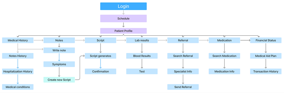
Information Architecture
.png)

Brand identity
VitalCare’s visual identity was designed to feel calm and trustworthy, using soft blues, clean typography, and simple shapes. Every element aims to reflect care, clarity, and confidence — the same values the app brings to healthcare.
.png)
4. Test: Learning from Real Use.
Once the prototype was ready, I wanted to see how it worked in real hands. I met with doctors and nurses to understand how they navigated the system, what felt natural, and what still needed work. These sessions gave me honest, practical insights that helped refine VitalCare into something truly useful for everyday care.
Goals

-
Evaluate how easily users can find, view, and add medical information.
-
Measure navigation efficiency during consultations.
-
Identify usability issues and improvement opportunities.
Research
-
5 participants: general practitioners and medical staff.
-
Location: private clinic in Cape Town.
-
Format: in-person moderated sessions.
-
Duration: 10–15 minutes per session.
Findings
1.
One of the first findings was that doctors wanted fewer clicks to reach information. Some screens were removed or modified, and the flow was reorganised to make VitalCare faster, clearer, and easier to use.
.png)
2.
The next finding came from the schedule screen. Some users struggled with the buttons and background, so I simplified the layout and added clearer details — like whether an appointment was in the clinic or elsewhere.
Before
After
.png)
3.
The next finding came from the schedule screen. Some users struggled with the buttons and background, so I simplified the layout and added clearer details — like whether an appointment was in the clinic or elsewhere.
Before
After
.png)